I have been playing around with Tableau Public recently as I am always looking to learn new analysis and visualisation techniques. To familiarise myself with how the software works I downloaded a CO₂ emission data set found here:
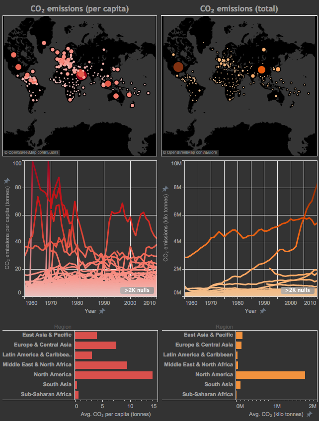
After playing around with the data, I developed the below interactive dashboard that summarises some of the most useful information in the data. The data points for each country in the world maps can be used to filter the data in the other plots. Since total or per capita CO₂ emission amounts seem to be arbitrarily chosen as the metric of interest based on what point is trying to be made, I thought it would be a good idea to have the two side-by-side for a direct comparison. For example, for a country such as the US, which has huge total CO₂ emissions rates, a per capita argument would most likely be used to show how well they are doing in containing their pollution. The opposite would be true for countries such as Qatar, which has fairly modest total emissions yet on a per person basis they are easily the highest. It seems to me that aspects should be considered when such discussions arise, hence the left side of the dashboard is concerned with CO₂ emissions per capita while the right side is about total CO₂ emissions.
Unfortunately, wordpress.com does not allow embedding of interactive objects such as Tableau dashboards. Therefore the image below is just a link to the daskboard and not the dashboard itself. Sorry about that but there doesn’t seem to be a workaround available.
Some points to think about or remember:
- The data points in the world map are actually the summations of the individuals lines in the middle panels. So while the US has the largest data point (meaning the most CO₂ emissions over the last 50 years), China currently has the highest rate of CO₂ emissions per year. China’s increased CO₂ contributions can be observed by the sudden upturn of its yearly emissions (fourth panel) near 2003 or so.
- When you click on a country in the map, the bars in the fifth and sixth panel are now taking the average emissions for one country only. Therefore, the region no longer has any meaning. Keep this in mind because otherwise you might think that the data is not consistent. There is probably a way to make this more clear and I will look into this issue for future posts.
- I have manually set the limits on the y-axes of panels three and four so that they don’t change when a country is selected. This is a personal choice since an automatically changing y-scale makes it hard to compare emission rates as you click between different countries.
Mick
2016/08/28
